RPG Trader

Building a interface-based mobile gaming experience from scratch

Project Description

The one-semester-per-project format, in the context of higher education puts a hard limit on the scope and complexity of student projects.

My team partner Ann-Kristin Hargus and I however aspired to maximize our experience gain by getting as far in the process of developing a game as possible.

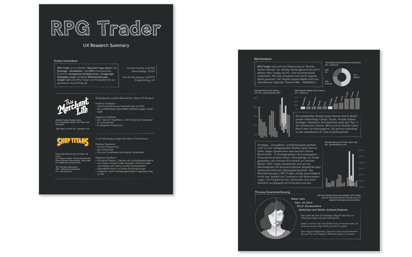
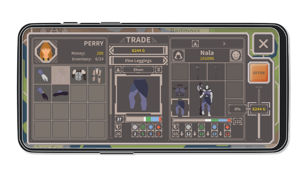
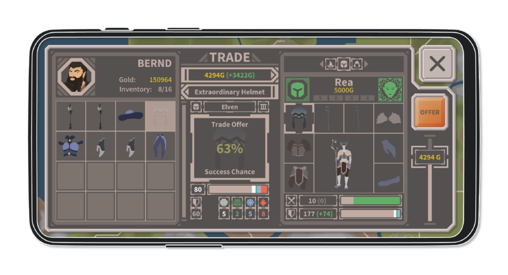
To this end we dedicated our practical project and our respective master’s thesis to the creation and optimization of the merchant-type mobile game RPG Trader.

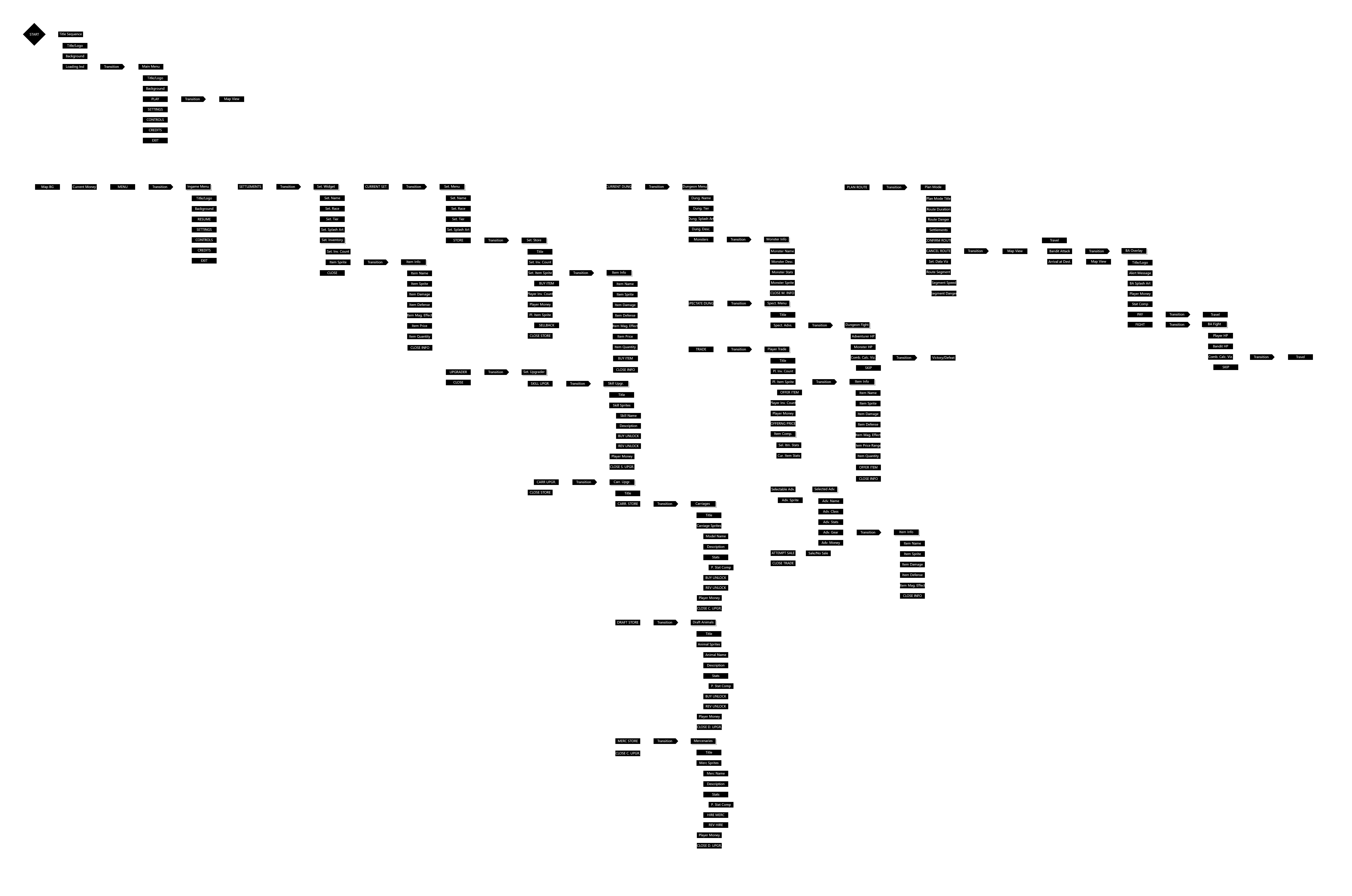
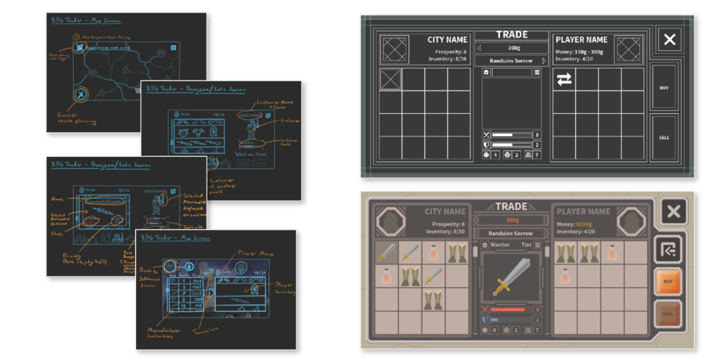
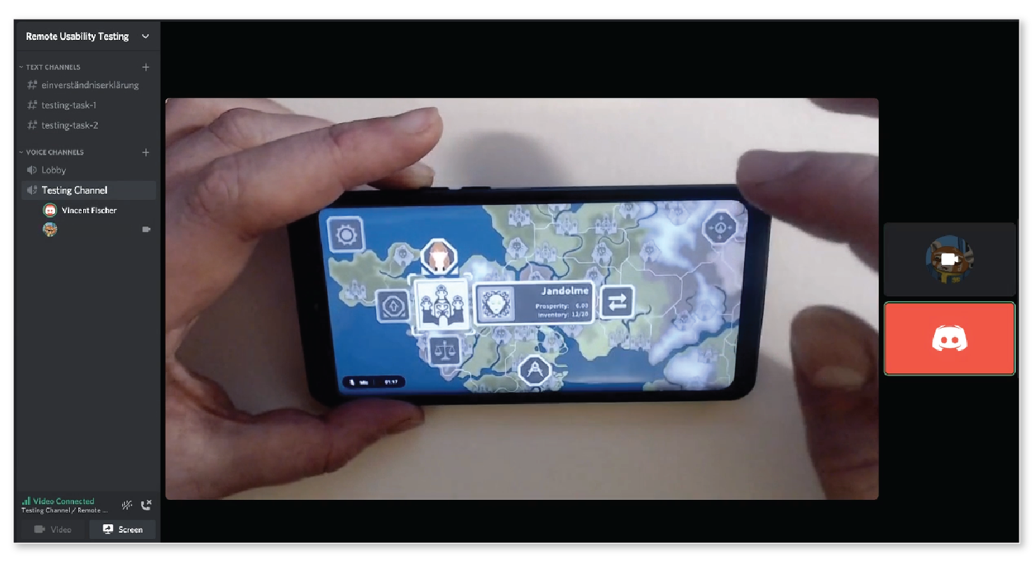
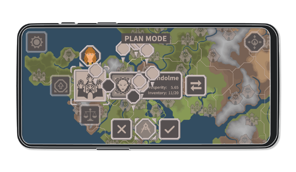
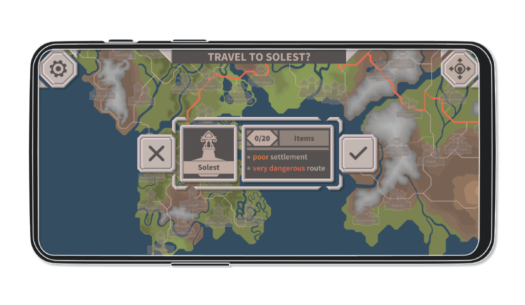
It is my largest and most comprehensive project yet. I designed gameplay mechanics, developed an information architecture, created a visual identity, designed and iterated an interaction flows and animated and implemented complex interface components in Unity. 

My part of the journey from idea to alpha is summarized here.

MY ROLE

Game Design
UX/UI Design
UI Development

CONTEXT

Self-Initiated, Practical Project at HS-Harz, Subject of my Masters Thesis

DATE

2020 – 2021
Two Semesters ≈ 11 Months

TEAM PARTNER

Ann-Kristin Hargus (Art, Programming)

Game Design

RPG Trader is a merchant-type mobile game in which players assume the role of a traveling merchant trying to amass riches by buying and selling adventuring equipment.

The core game play loop consists of the three steps: buying, traveling and selling.

The primary objective in game design was to make this simple game play loop as fun and engaging as possible.

Emergent Economy

Among other mechanics, the game features a dynamic economy system based on a cellular automaton. 

This system produces emergent fluctuations of ware prices and availabilities at the various settlements over time.

This system is also influenced by player actions.

Classes, Cultures and Bandits

The players customers, the adventurers have classes, cultural heritages and individual statistics.

These factors influence how likely they are to buy certain pieces of equipment and how much they are willing to pay.

To make the process of traveling more interesting players also can and will be ambushed by bandits while traveling.

These are just a few examples of mechanics that were conceived and implemented to add debth to the simple core gameplay loop.

First-Playable

The first major milestone to reach was to produce a first-playable version of the game, in which the core gameplay loop could be completed. Getting there required some groundwork.

UX Research

Parallel to the writing of a comprehensive game design document, I conducted user and market research.

This research was later distilled into a product requirement document (PRD), specifying the project’s goals, scope and both user and business requirements.

Information Architecture

I mapped out the information architecture to establish a logical structure for the games interface. 

This included the definition of menus and submenus and navigation between these as well as the information and interactive elements contained within each section of the interface. 

Sketches, Wireframes, Visual Design

I subsequently designed the visual appearance moving from quick sketches to wireframes and lastly to final assets ready for implementation. In this process a unique visual identity was defined. 

This visual identity had to evoke a sense of familiarity to fans of classical high fantasy RPGs while setting itself apart from its competitors. 

Font and Colors

The color scheme was made to resemble materials associated with medieval times. Metallic grays for borders, parchment teal for menu structure, text and symbols and a dark gray, like blackened leather or slate, for backgrounds for instance.

Muted colors were selected to set the games style apart from the bright and colorful aesthetic commonly found in mobile gaming experiences. 

Source Sans Pro was the font of choice. It reads great on screens and fits the theme with its geometric but not too modern appearance.


Motion

Interactive elements respond to interaction with animated feedback. This feedback is designed to seem halfway between mechanical and magical. 

This serves to make interaction feel tangible, playful and satisfying.

To avoid hindering the interaction flow
all animated transitions connected
to interactions are shorter than 40 milisecons.

Implementation

To be able to evaluate iterate the first designs quickly they were first implemented in unity as simplified prototypes consisting of wireframe graphics.

The final assets were put in as soon as the intended functionality and behavior had been achieved.

The resulting first playable featured a settlement trade menu to acquire wares, map view within which routes between locations could be planned and traveled and a dungeon trade menu through which equipment could be sold to adventurers.

Improvement and Completion

The interface of the first playable version was neither complete nor did it provide a acceptable degree of usability. 

So I made the subject of my master’s thesis to improve upon my prior work using UX design methodology.

Evaluation

Following a user centered development cycle, the next step was to evaluate the design of the first playable version.

To this end I conducted remote usability testing to discover what issues occurred when the interface was interacted with by realistic users.

In addition, I conducted an in-depth analysis of the initial state of the interface by judging its compliance with ten recognized usability heuristics.

Iteration

Various usability issues were revealed in the evaluation of the first-playable game version. These issues were then brought into context with the behavior and appearance of individual interface elements to trace the issues down to their likely root cause.

With these causes identified, new solutions could be designed. 

For the sake of brevity only two general examples are given here. For a more detailed impression of my work and processes please feel free to look through my master’s thesis.

Map View Usability Issues

In the first playable version, plotting routes from one location on the map to another required the activation of a plan mode, in which a route could be plotted by selecting one intersection after another. 

This interaction flow wasn’t easily discernable for the usability testing participants who expected to simply select a destination and be presented with a route. It also caused overlap and clutter.

Map View Iteration

Instead of selecting a chain of intersection nodes to plot a path to a destination, players would now simply select a destination and be presented with a simple yes or no question whether they would like to travel there or not.

Not only did this match user expectations and reduce the number of taps necessary to plan a route and travel to two, it also reduced clutter and overlap.

Trade Menu Usability Issues

The challenge in RPG Trader is to make as much profit as possible with each sale.

In the first playable version it was not explicitly expressed how much profit the sale of an item at any given price would generate.

Players needed to remember at what price they bought an item when they sold it and manually calculate their profit.

Trade Menu Iteration

To reduce the strain on players working memory, a simple colored text component was added to explicitly express profits in green and losses in red.

The same pattern was applied to every part of the interface where the concept of positive or negative, win or loss needed to be expressed.

This made it significantly easier to judge if a given action or transaction was beneficial or not and if so to what degree.

RPG Trader Alpha

The insights gained through usability testing and evaluation were channeled into new design solutions for a variety of small and large usability problems. They also informed design decisions in the creation of additional interface components.

Over the course of this master’s thesis the RPG Trader game grew from a generally functional first-playable into a feature complete alpha version, suitable for play-testing and balancing. 

This alpha version has the following features:

Buy low.

Travel around and manage risk.

Sell wisely and sell high.

Reinvest your profits.

What I've learned.

Know the whole process to play your part well.

Throughout this project I’ve been a Game Designer, UX Researcher, UX/UI Designer, UI Artist, Motion Designer, UI Developer and even a kind of Creative Director. All the while I worked closely with my team partner, herself a Developer and Artist.

Wearing all these hats at once gave me an even deeper appreciation for the interplay of the various roles involved in game development and their individual needs and requirements. 

While I’m primarily a UX/UI Designer, this experience will help me communicate and work with adjacent disciplines more efficiently. 

Work smart.

This project was ambitious. A lot needed to be done in very limited time. 

This challenged me to find ways to do more, faster, without compromising quality. 

I did so by modularizing my designs whenever possible and make them flexible so I could adjust quickly and avoid rebuilding similar components whenever something new was implemented. 

I also did so by thinking ahead, trying to anticipate issues that could arise in implementation and account for them in design ahead of time.

next project