During my master’s studies I had the chance to participate in the development of a game Olympics themed brawler game, in collaboration with Japanese bachelor students.
The result was to be a vertical slice of a straightforward casual gaming experience intended to be presented at an exhibition.
I was responsible for the design and development of the game’s user interface. I had the opportunity to focus on creative and interesting ways in which players could be adequately informed about their scores during and after the game and the time left in a round, utilizing color, shape and motion.
I also had the chance to design and implement basic interface components like a main and in-game menu and make them both useful and enjoyable to use.
MY ROLE
UI Design UI Motion Design/Animation UI Development
The first milestone to reach, was to produce a playable first version of the game.
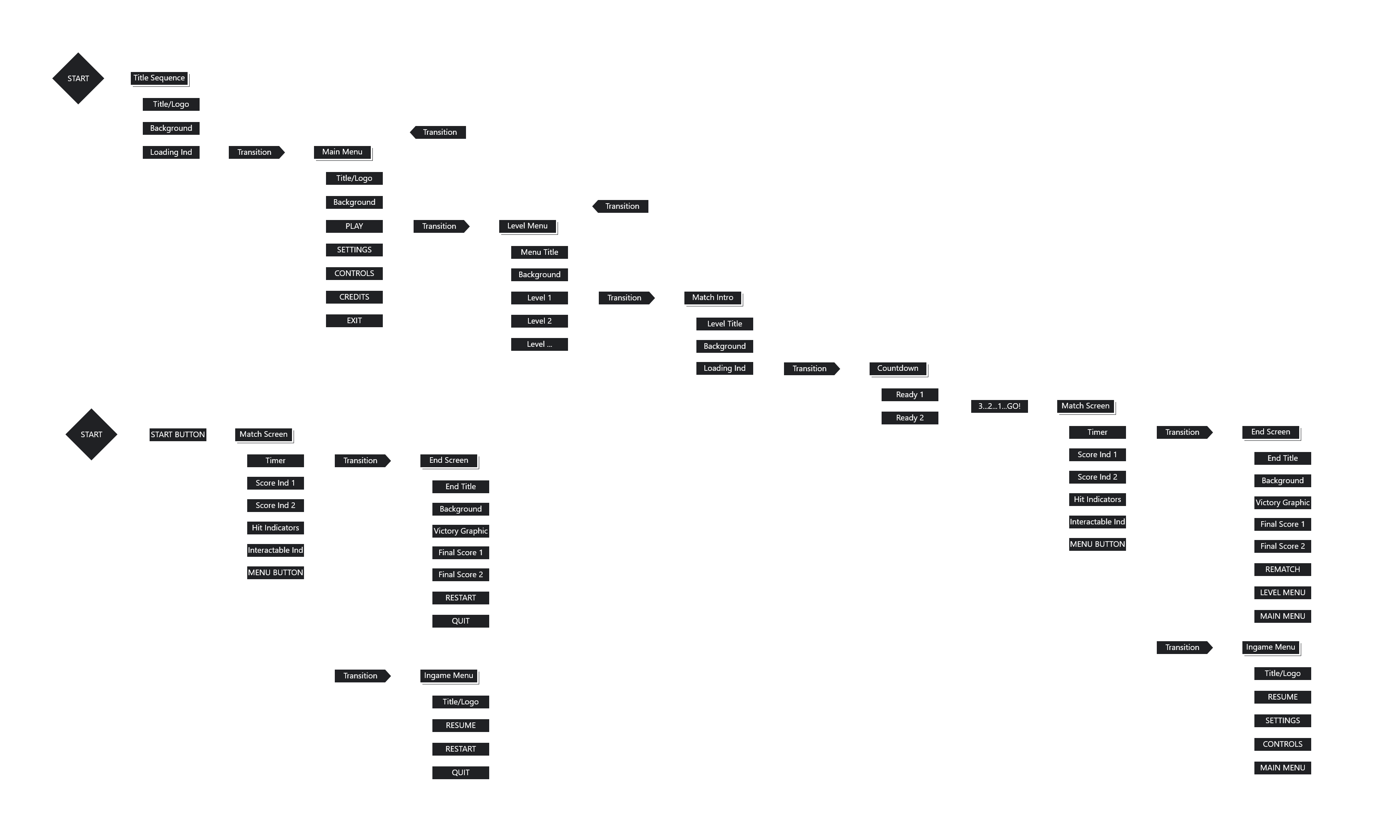
To get started I mapped out the games information architecture and extracted the part necessary for the first playable.
This included the definition of every section of the interface, the information and interactive elements contained in each and paths and transitions in between.
First Playable UI
Ideas for the in-game UI were sketched, a favorite selected, visually designed and implemented prototypically.
The first-playable version of the UI still contained numbers to represent scores and time.
Discussing this first version with the group the decision was made to pivot to a form of visualization, that could be read and understood regardless of players origin and language.
The number of players was also reduced from four to two.
Final UI Design
With the new requirement in place, I started to develop ways in which necessary information could be displayed without symbols.
This was in essence a process of taking the present interface components and reducing them to what was fundamentally relevant.
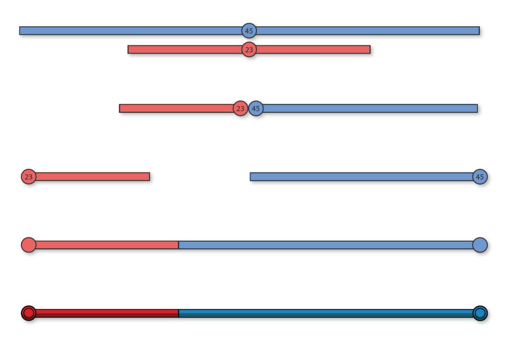
The score system for instance didn’t necessarily require players to know exactly how many points they had. What mattered was who had more. So this what needed to be displayed.
The result.
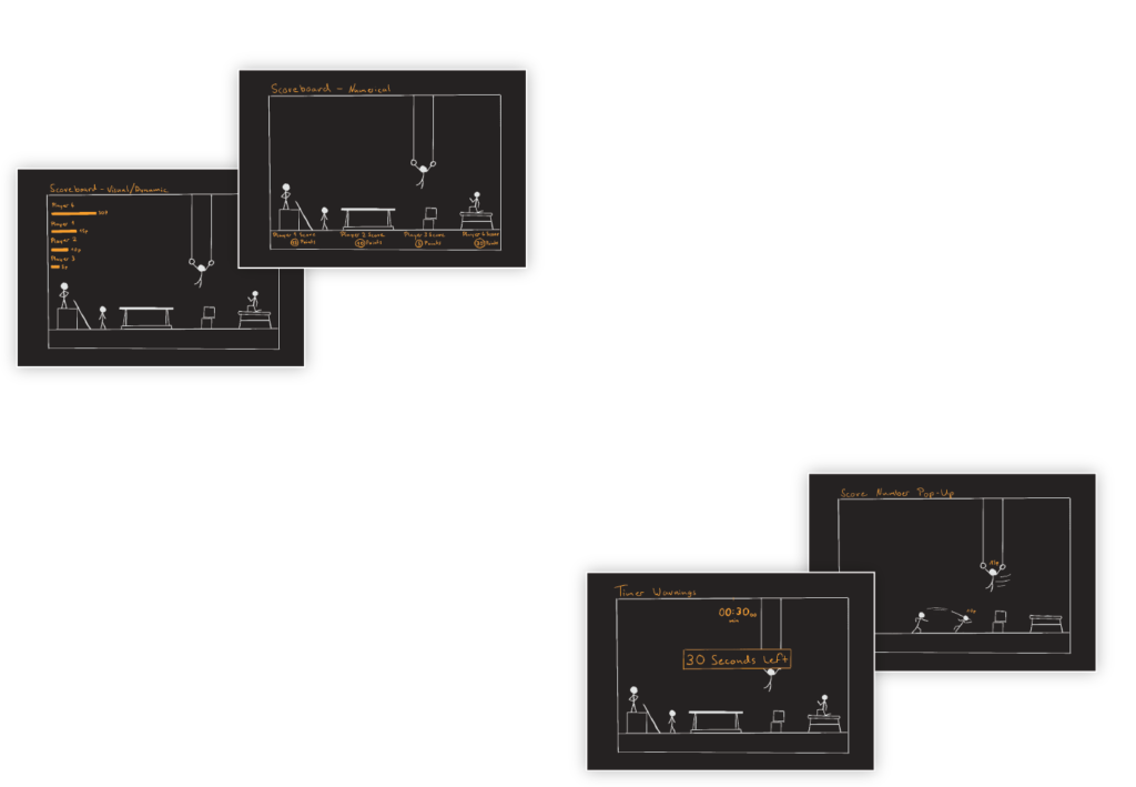
Score Display
There were three essential pieces of information that needed to be given by the in-game UI.
First, which player had more points. This is expressed by a single bar displaying scores proportionally in each player’s color.
Scoring Feedback
The second essential piece of information was, which actions were awarded by roughly how many points.
This was still displayed by bubbles emitted by player characters whenever they scored points.
These bubbles where made more visible and would now fly into the score bars to make their meaning obvious.
Time Display
The third piece of information was, how much time was left in a match.
The time display was translated into a single bar dwindling in one second steps towards the middle to maintain symmetry and balance.
The time bar received a stopwatch icon to add a little more clarity.
Menus and Transitions
With the in-game ui in place I designed and implemented a main and an in-game menu, a match start flow and a victory screen visualizing final scores to complete the UI.
Each of these components received animated interaction feedback and transitions to make navigating through the interface playful, smooth and enjoyable.
It was decided to keep these parts of the interface text based to avoid ambiguity, but make sure that the design allowed for easy localisation later on.
What I've learned.
Be like water.
Requirements change, it’s always good to be able to adapt quickly.
Good teams find a way.
I’ve worked with many different teams before. In this project I only shared a language with the German part of the team, so this was a first.
But barriers are meant to be overcome. In this case we made it work by utilizing a combination of english to japanese translator discord bots and google translate.
Limitations breed creativity.
It was a good exercise to be restricted to only some of the tools I have come to rely on to convey information.
It is surprising how many ways of expressing something you can come up with when spelling it out isn’t an option.